Carbon Visuals has been working with the United Nations Environment Programme (UNEP) in a project undertaken in conjunction with our not-for-profit partner CarbonSense Foundation. Our brief was to design and create a short, high impact video to convey the scale and complexity of resource use in the Asia Pacific region. In addition a set of interactive web-tools have been produced to complement the film and allow easy exploration of the data. You can see more about the project here.
Our Communications Manager Anna Lodge spoke to Janet Salem, Programme Officer, Sustainable Consumption and Production with United Nations Environment Programme (UNEP) in the Regional Office for Asia and the Pacific. As our main contact within UNEP, Janet has had first-hand experience of collaborating with our creative team. So we thought we would ask Janet about this experience…

Janet Salem with colleagues, including UNEP Executive Director Achim Steiner
AL: How did you come across the work of CarbonSense and Carbon Visuals?
JS: It was quite some time ago. I saw the film you did for WBCSD which showed global carbon emissions. It was situated in Manhattan around the UN summit. I got it immediately! I realised this is what we needed. It was the missing piece: Something visual that contextualised policy, and helped people making policy decisions see the big numbers.
AL: The first and one of the biggest challenges on this project was the size, complexity and abstract nature of the data. Tell us a bit about the data and where it had come from and why it was so critical to have visuals.
JS: The data is about natural resources. These are the inputs into the economy, taken from the environment. The data for Asia Pacific came as a result of 25 years of methodical development. This was the first time it was available in complete form. We knew it would take years to analyse the data. The need to get the data to people was more urgent. Therefore, we concluded that visuals were needed to draw policy makers’ attention to the data. The video you produced was released at the same time as a 150 page report. But we needed the film to help draw the policy officials to the topics and information contained in the report.

Sketch from storyboard: Actual volume of biomass, fossil fuels, metals and minerals required to generate one dollar of GDP
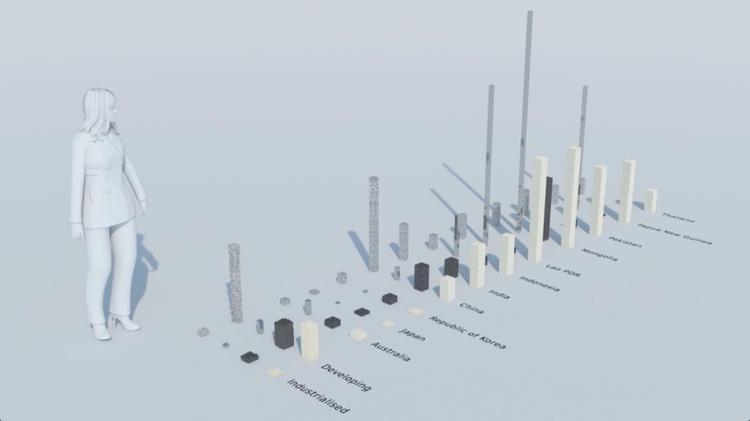
Image from film: Actual volume of biomass, fossil fuels, metals and minerals required to generate one dollar of GDP
AL: On the film production, we worked together from outlines, storyboards, scripts to animatic and draft films. We particularly appreciated your hands-on involvement with the with live action part of the project. What parts of the joint creative process were most critical from your perspective?
JS: We really valued the work we did with Carbon Visuals in the early stages of the process: to figure out what our messages were. It was great to have people come in fresh to the topic but who really understood the importance of the data. Carbon Visuals really helped us focus on the info that would get the maximum impact – rather than sharing the maximum information! The process of developing a storyboard was a lot quicker than it could have been because of this.
As an example, initially we were resistant to focusing on water within the film but the Carbon Visuals team really helped us understand that it was important to help people into this complicated area of ‘resource efficiency’ with something easy to recognise. A few months on, when I show people the film they react to the water section of the film. Then they ask all sorts of really important questions like ‘why is it so different for each country?’ Carbon Visuals helped us understand exactly what would grab policy makers’ attention.
Alongside this the team at Carbon Visuals also have a whole expertise which the UNEP does not have in-house - about how people understand information shared visually. This knowledge of visualisation has been absolutely essential to this whole process.

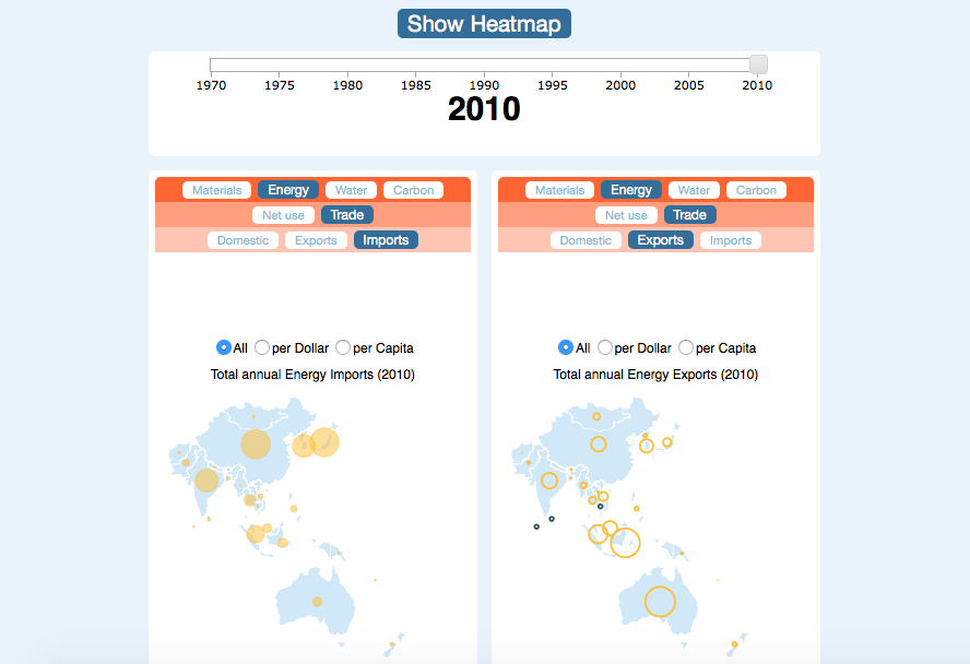
Image from film: water use per $USD of GDP for countries in Asia Pacific region
AL: Working remotely but collaboratively is an essential part of working on projects like those within UNEP where regular and effective communication between the teams is critical to building trust and ensuring the best creative process. What do you think has made this process work so well, even at a distance?
JS: The Carbon Visuals team were so dedicated. They were available to speak on Skype, often the whole project team. We were sent material in advance for us to comment on. I really appreciated all the drafts and later the snippets of final material that were sent through as the project got close to completion. This was a significant project and budget for us at the UNEP and therefore it really helped us know that it was progressing in the right way.
We were showing materials to the wider team to a degree so it was also useful to have the technical context with draft material. A final film has impact, but early on, without the music and final detail it was important that everyone could see beyond what they were looking at. We needed clear guidance on what feedback was needed. Antony and the team gave us this context and guidance which was really useful and reassuring.
AL: We believe that a film / interactives combination makes the perfect data communication. The film aims to raise interest and get the audience asking questions. These then ’signpost’ to the interactives which enable people to explore the data much more fully. What role do you think the interactives play within the whole package of communications around the Asia Pacific data?
JS: We definitely knew that we wanted infographics and really liked the idea of a tool, the interactives, that people could download and use. There is more info about national resource use within the interactives, so they form a more complete resource for policy makers to use and get everyone interested in the data. We are also likely to include it within revisions to training we use around resource use indicators. This will be a really useful way for students to play with the data. It is early days with the interactives so we will be looking more at how we can evaluate the impact they have.

Image from film: real time water extraction in Asia Pacific region
AL: We hear the film went down really well at the 1st Forum of Ministers of Environment where the UNEP report ‘Indicators for a Resource Efficient and Green Asia and the Pacific’ was launched. What impact are you looking for from the film, longer term, within the work you are doing?
JS: It was great to have the film for the launch. It really helped us make the most of that event. Resource efficiency was identified as the 2nd sustainability priority at that meeting, and the video probably helped to participants see the relevance. So the policy impact was immediate.
There was also country impact at the meeting. For example: one large developing country in the region is talking, following the launch, about how to monitor resource extraction. They are about to step into a new phase of resource extraction and continue to have water issues. So at national level the data and the materials like the video provide an evidence base for policy discussion. Many countries see themselves as developing nations with low resource issues but efficiency affects them all, it is all relative.
Globally this work is only just getting started. The videos are still being shown in other locations including Thailand and Australia. We have a version in Thai (which we showed at the World Environment Day event) and one with Chinese subtitles.
The sustainable development goals for the UN are still under negotiation. As countries look at the goals we are able to use the video and other material to get them engaged in resource efficiencies. Asia has a big voice in this. Previously, there was the impression that only wealthy countries invested in data collection.
Regional offices elsewhere are interested in developing similar videos - seeing it as something that can help get dialogue started, visualising the complex. At the Asia Pacific office we have lots more stories to tell so are interested in the next step. We have learnt a lot about how much this work is about helping people have an emotional connection with this issue. So the more we can make data like this accessible and connect with people’s emotions, the more impact we will have.
For more information about our work with UNEP Asia Pacific click here.