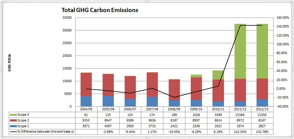
Typical organisational carbon emissions graph
It is often said that what gets measured gets managed. In many organisations, the first concerted effort towards managing carbon is the calculation of an annual carbon footprint. Emissions from fuel burnt on site or used for vehicles (Scope 1) are calculated; emissions associated with purchased electricity (Scope 2) are calculated using conversion factors; and thus an annual baseline is established.
In subsequent years, the accuracy of these calculations is often improved and the account is also expanded to include other (Scope 3) emissions such as those associated with outlying estate, travel and third party transport services. One consequence of these changes is that the carbon footprint being reported can increase. This is a challenging moment for a company - especially for people charged with reducing emissions. They may be tempted to hide the results away out of sight.
An alternative response is to emphasise improved accounting, greater transparency, reduced risk and the potential for a better CDP score: bigger really can be better. Visuals can help to get these messages across with confidence and increase traction in the drive for improvement.