Real Time — Projects — Carbon Visuals

Talk to us about your environmental communication challenge

Real Time

University of exeter trials Emissions Visualiser

CLIENT

University of Exeter, UK

PURPOSE

To reduce the environmental impact of the University of Exeter by raising awareness of energy use and carbon emissions and encouraging energy-saving behaviour and actions.

DESCRIPTION

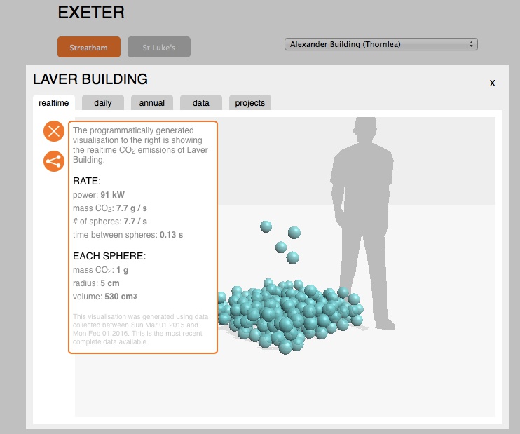
A prototype interactive web-tool and animation that presents energy data in a way that could help academics, staff and students understand the environmental impact of all 120 buildings on the two campuses at Exeter University.

The university has set an ambitious carbon reduction target of 43% by 2020 based on emissions in 2005/2006.  Achieving this reduction is going to be a challenge for the University as it continues to grow and provide quality facilities for teaching, students, research and staff.

The estates department wanted to see if Carbon Visuals could create a web-based interactive that would engage people on campus in the energy consumption and carbon footprint of all the buildings in a non-technical and visual way.  Initially sized for running on tablets, the prototype tool runs on desk-tops and mobile phones with modern browsers.  The inclusion of social media links allows images and information to be shared and opens the way for more dialogue with the Estates Department.  

In order to raise interest in the web-tool we also created a simple animation and VINE showing the total real-time carbon emissions of the university.  

The effectiveness of the web-tool will now be tested with groups of students, academics and appropriate staff.  Note that at present the Projects tab for buildings has not yet been populated. 

A similar prototype tool, animation or overview visual can be created quickly and economically for any university, college or estate - anywhere in the world.  We are currently looking for up to six additional universities who would like to pilot this communication method.

To find out more contact:  Antony Turner +44 (0)7973 641131      antony.turner@carbonvisuals.com


ENGAGED AND NON-ENGAGED AUDIENCES

We specialise in reaching non-engaged audiences. People who do not feel ownership of the data you present and do not come to the data with prior questions of their own are what we call non-engaged audiences. They have very different needs from other audiences for data visualisation, but the distinction is often ignored. Most data visualisation is created as if the audience already understands the significance of the data and are keen to explore it.

Engaged audiences include building managers and people charged with reducing environmental impact or cutting costs. To present energy data or emissions data to these audiences, graphs and other abstract representations are appropriate. These audiences already know what they are looking at  they just want to scrutinise it for any trends that can provide insight or hints for improvement.

This text is from our blog that provides the rationale for this interactive tool.  

California's massive methane leak

PURPOSE

To illustrate how an interactive animation can help communicate a quantified yet invisible environmental challenge

DESCRIPTION

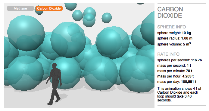
We have produced an interactive animation to visualise and bring insight to the rate at which methane is being released from a gas leak in California

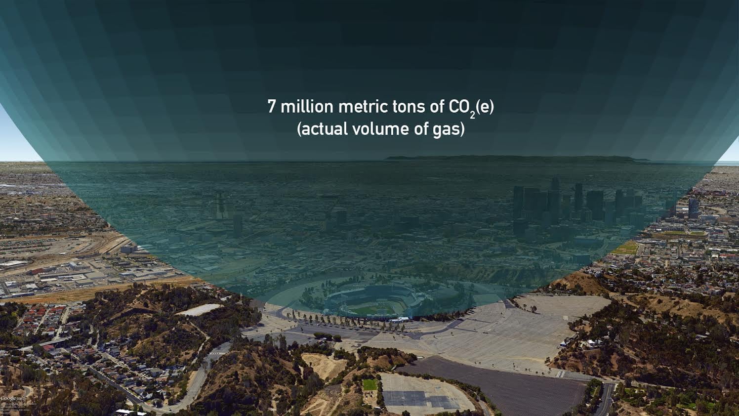
In Aliso Canyon in California, a gas leak is spewing methane into the air. On the 23rd of October 2015 the leak erupted at a natural gas storage facility near Los Angeles.  As of the time of writing (Jan 2016), this leak is still ongoing - at an enormous rate. We have created the interactive animation below to give insight as to the scale of that rate.

We used emissions rate data from here (report by California Air Resources Board), though we could potentially link this value to a live data feed.

We have used a figure of 84 for the CO2 global warming equivalent of methane (over a period of 20 years). This number was taken from a report published by the IPCC on Anthropogenic and Natural Radiative Forcing (chapter 8, page 714, table 8.7).

This visualisation is produced in your web browser so the quality e.g. the ‘look’ of the bubbles cannot be as sharp as in a pre-rendered animation. This also means that it may run a little slowly on some computers - switching to a different browser might help.


What does this visualisation show?

This visualisation is showing us accurate volumes of gas at (approximately) the actual rate at which they are being emitted. Each sphere represents 10 kg of gas. After 4 tonnes have been emitted the animation starts again from the beginning.


Why show Carbon Dioxide as well?

Methane is a powerful climate pollutant and greenhouse gas. It’s about 84 times more potent than carbon dioxide. This means that 1 kg of methane being emitted will have a similar effect on global warming as 84 kg of CO2. If you click the button at the top of the visualisation marked ‘Carbon Dioxide’, you will be able to see the CO2 equivalent emissions rate.


Where can I find out more?

Our friends at Environmental Defense Fund have published an informative article on the Aliso Canyon leak here.

Click here to see their aerial video showing the methane plume.

Below is their real-time methane counter which we really like.

Carbon Brief also have an excellent article and infographic here.


Other approaches

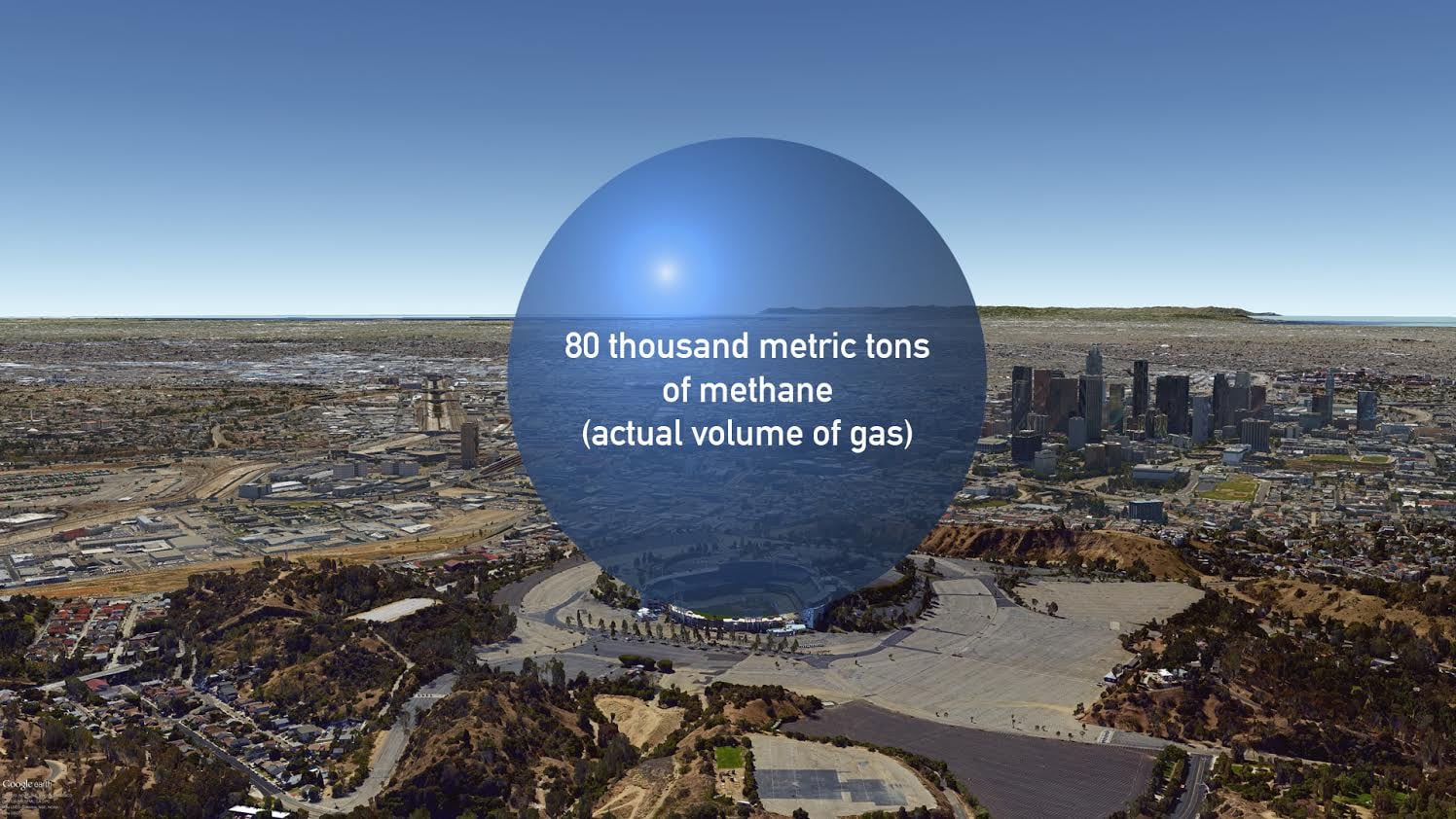
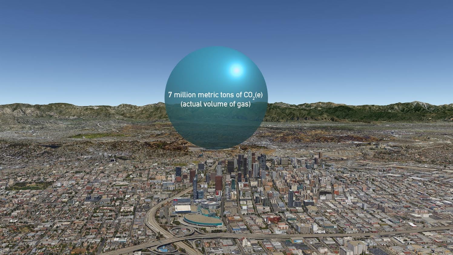
In the course of exploring different visual options we created some sketches in Google Earth.  Initial sketches were created with giant bubbles located at the methane leak site but these did not work as there is no scaling object or building.  Placing the bubbles in Los Angeles seemed the next best option but again the geography of the city does not help.  So these are included for interest, but are not considered finished images.


Social Media Use

Simple interactives with short Vine or GIF animations can get extensive social media attention.

How do you sell low carbon?

CLIENT

Self-initiated

PURPOSE

To put visuals of real-time emissions into users hands.

DESCRIPTION

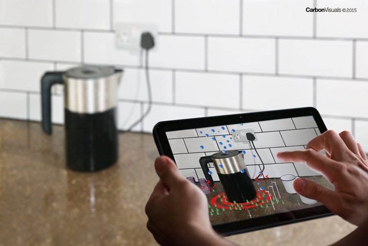
Development of an augmented reality app that reveals actual volumes of CO2 through a smart-phone or tablet screen.

How do you sell low or zero carbon products and services? As more and more companies are putting serious effort into developing products and services for the low-carbon future they face a communications challenge with consumers or B2B customers. How do you get across the benefits of low-carbon in a way that works?

Now there is a solution... an augmented reality app that reveals actual volumes of CO2 through a smart-phone or tablet screen.

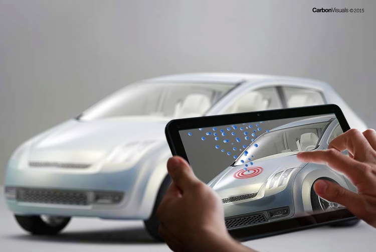
We are pleased to announce that we are developing an app which allows viewers to ‘see’ the volumetrically accurate carbon emissions associated with household appliances, furnishings, vehicles, buildings, power stations... as real-time flows or bubble piles. Furthermore, using the app, sales teams and their potential customers will be able to compare services and products clearly showing the difference in emissions in the purchase of low-carbon options.

The ability to reach out to consumers through simple apps is very compelling.

Antony Turner, CEO Carbon Visuals

The ability to reach out to consumers through simple apps is very compelling. In addition we can design a complete sales solution around the app that engages and easily invites B2B or B2C customers to purchase low-carbon options.

Key features of the app include:

COMPARISON - shows the carbon footprint of products or services in comparison to your competitors

ACTUAL VOLUMES - demonstrates the actual volumes of CO2 as real-time streams or bubble piles / blocks

SHOW COSTS – combines with other important metrics e.g. costs

EASY-TO-USE - we work with your marketing team to create relevant and easy user interface within your sales campaigns

Versions are envisaged that highlight and compare low-carbon benefits of energy, vehicles, furnishings, building products etc.

For instance we can design a system for the green energy market where consumers are invited to buy energy that has a substantially lower carbon footprint than a fossil-fuel based energy mix. We envisage combining the technology with an elegant sales promotion campaign developed with the energy company's own marketing team.

Another example envisaged would be a version for use in car dealerships where new plug-in or eco-efficient cars are for sale. A simple set of questions about a customer’s existing car and journeys can allow the sales rep to immediately show the emissions associated with the 'old' car v the new model alongside financial savings.

Educational opportunities are limitless provided the data is available, and games-based versions could enable understanding of our 'high-carbon' world in a fun and sharable way.

To find out more about how this app could help your sales campaign, or to discuss other potential applications, please contact:

Antony Turner, CEO antony.turner@carbonvisuals.com

Global CO2 emissions in real time

How can you give people some sense of the rate at which we are adding emissions to the atmosphere?

Using 2010 data, we calculated that at standard pressure and 15oC the mean rate of emissions for that year would fill a volume the size of the UN Secretariat Building roughly seven times every four seconds. Working with our associate Lucy Blackwell we created a simple experimental low resolution animation which we have shown to live audiences on numerous occasions.

Some people find it “breath-taking”.