atmosphere

Communicating vital scientific services

CLIENT

ECMWF (European Centre for Medium-Range Weather Forecasts)

PURPOSE

Create a set of short films that explain the Copernicus Climate Change and Atmosphere Monitoring Services that ECMWF carries out on behalf of the European Commission.

DESCRIPTION

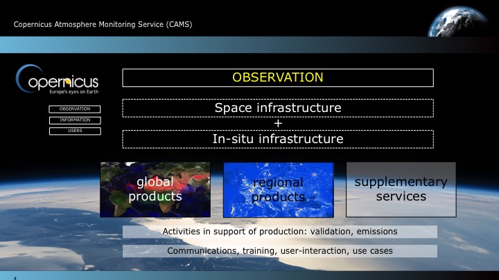
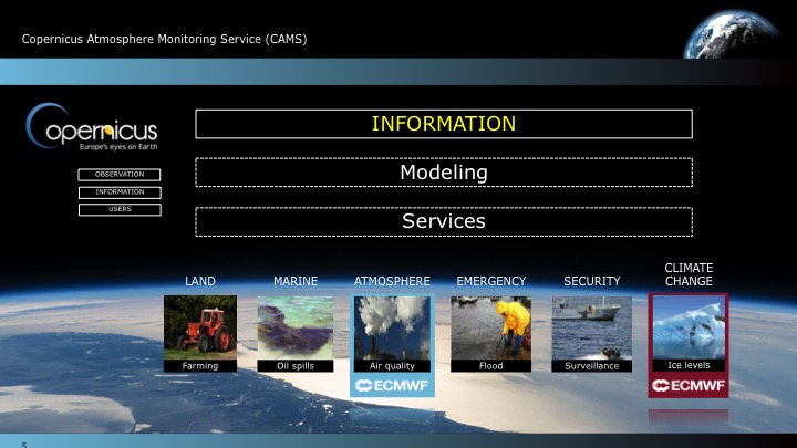
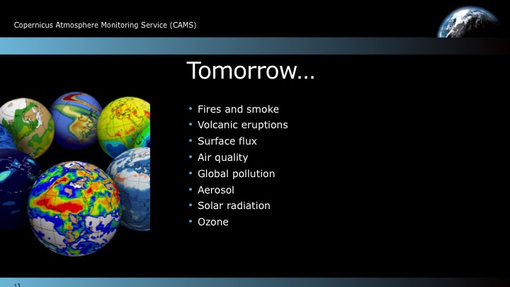
Carbon Visuals created a film that shows the overall Copernicus services, as well as separate films for each service.  These films highlight our ability to help communicate complex services for the scientific community in ways that are not only true to the science but also make sense to a general, non-scientific audience.  In addition we designed a set of PowerPoint slides for ECMWF scientists to use at key events.

Copernicus is the European Union's (EU) flagship programme on monitoring the Earth’s environment using satellite and in-situ observations. Copernicus delivers operational data and information services on a range of topical areas. 

See more at: http://climate.copernicus.eu/ / http://atmosphere.copernicus.eu/

Ozone campaign meets climate change

CLIENT

United Nations Environment Programme (UNEP)

PURPOSE

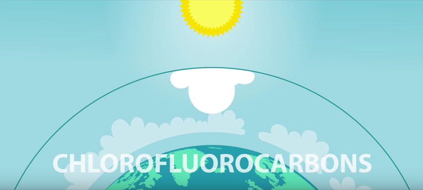
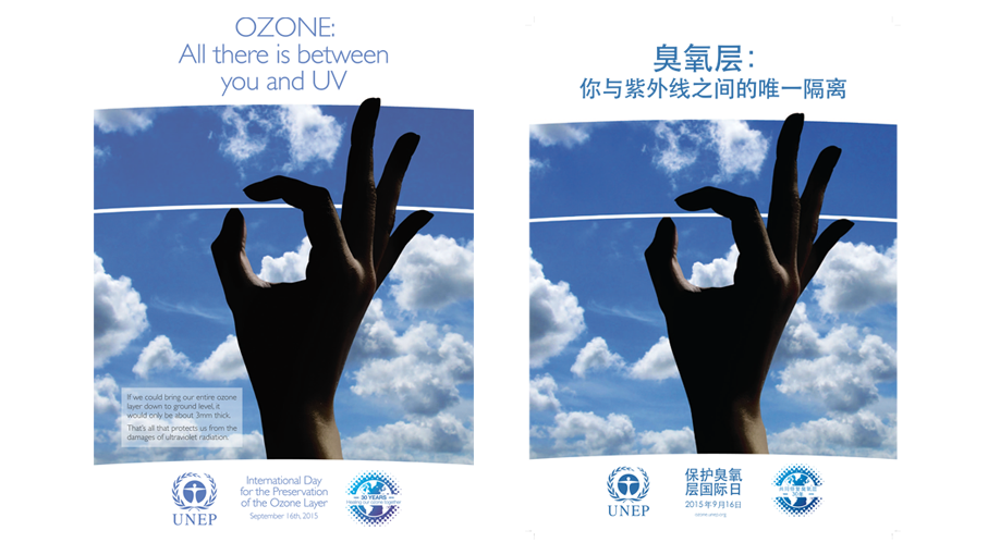
To communicate and celebrate 30 years of international effort in protecting the ozone layer.

DESCRIPTION

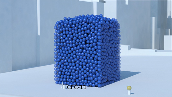
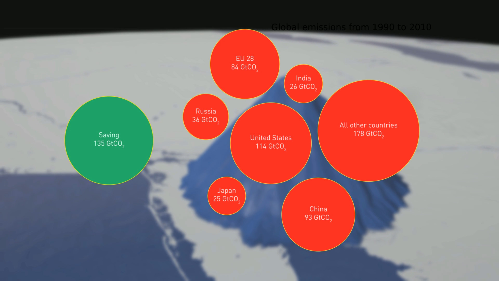
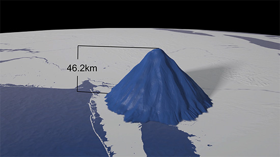
An animation that shows the global warming potential of ozone depleting substances - very much greater than carbon dioxide.  The film also shows just how much greenhouse gas - 135 billion tonnes of carbon dioxide equivalent - the Vienna Convention has kept out of the atmosphere.  It turns out to be more than the Kyoto Protocol.

This animation is the final asset created for the digital campaign for UNEP.  The project included the design and production of:


PRECIOUS OZONE - THE SIZE OF IT

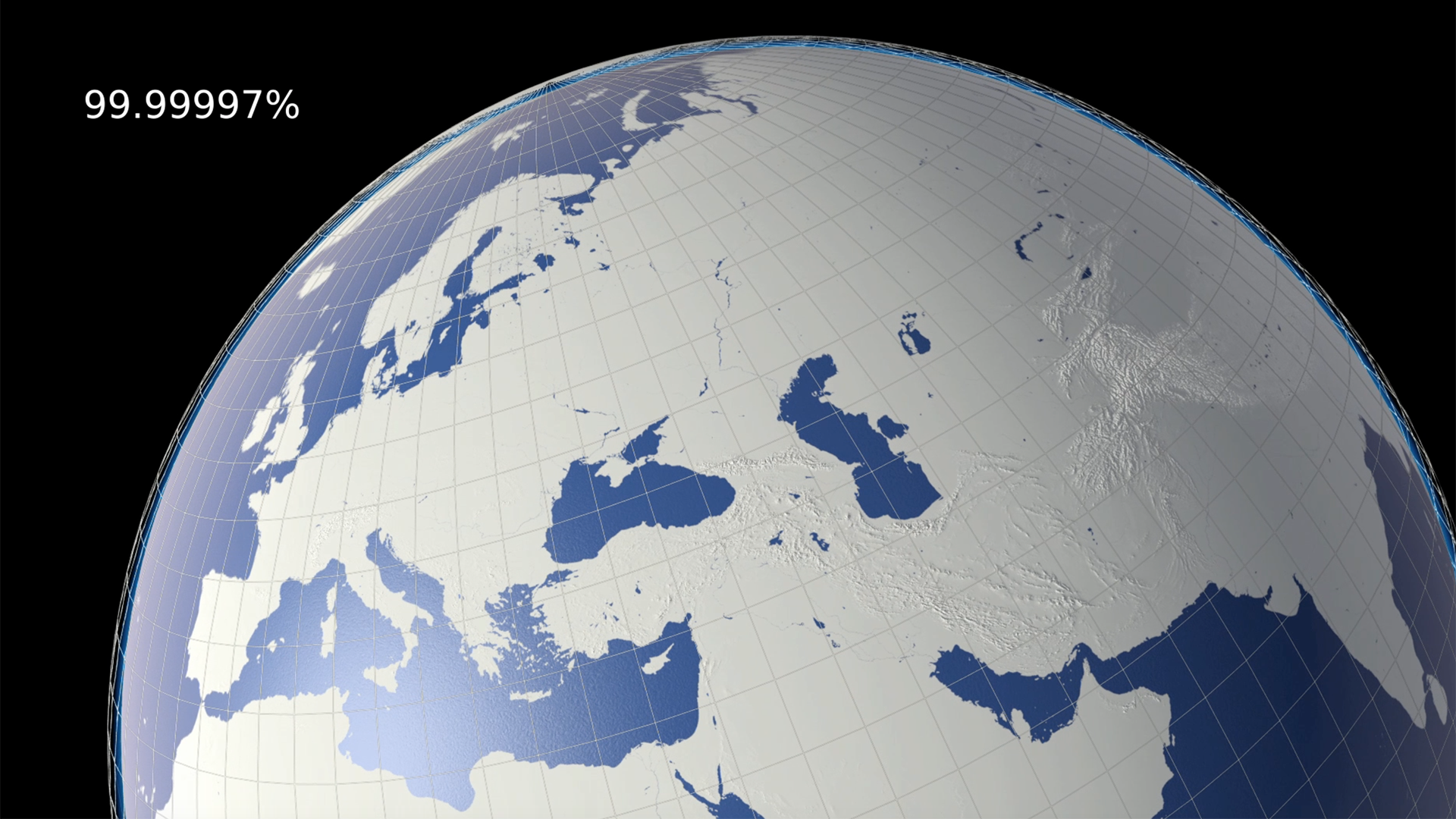
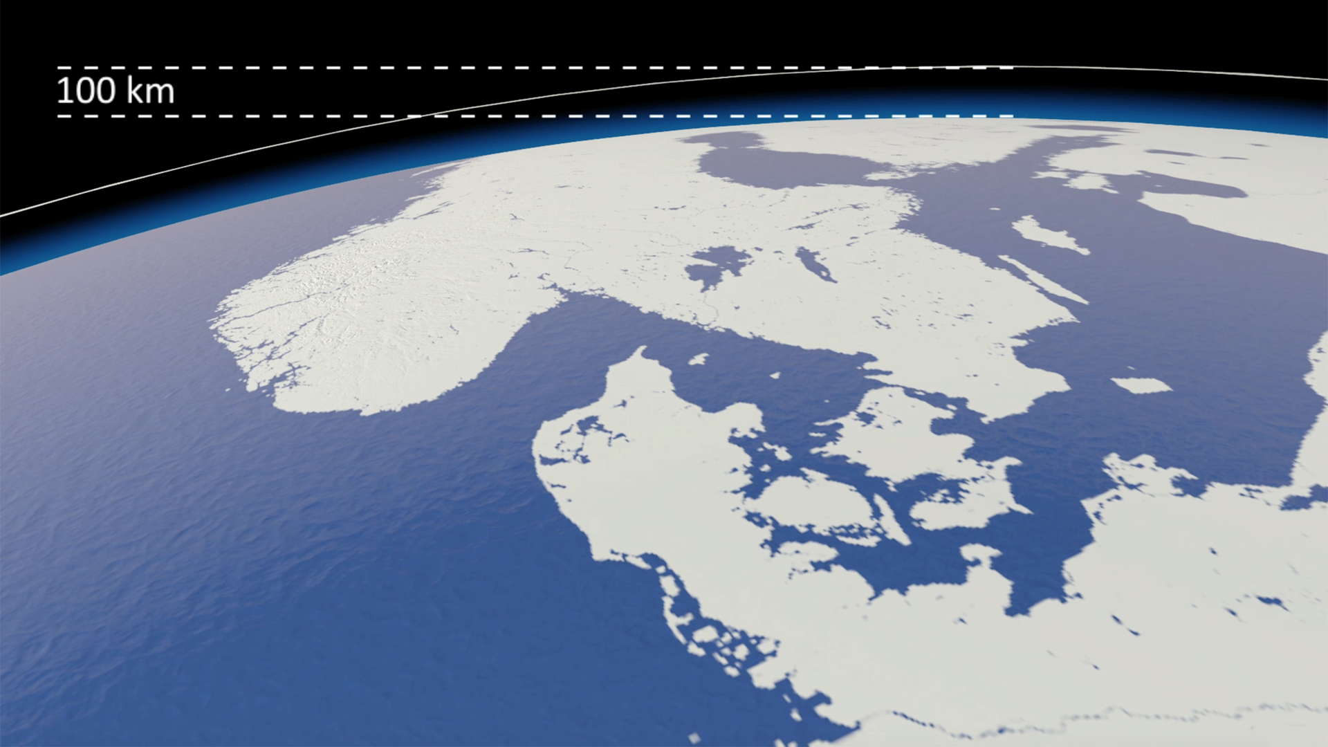
A short animation and a set of still images give viewers a sense of scale for how much air there is in the atmosphere and how much of it is ozone.  More details here


OZONE GLOBE

An interactive / self-running globe that displays current ozone distribution and also celebrates each country’s ratification of the Vienna Convention. More details here


2D AIR MAP

This interactive 2D map of the atmosphere allows users to explore the distribution of ozone for themselves. More details here

3D AIR MAP

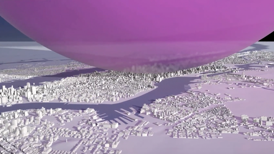
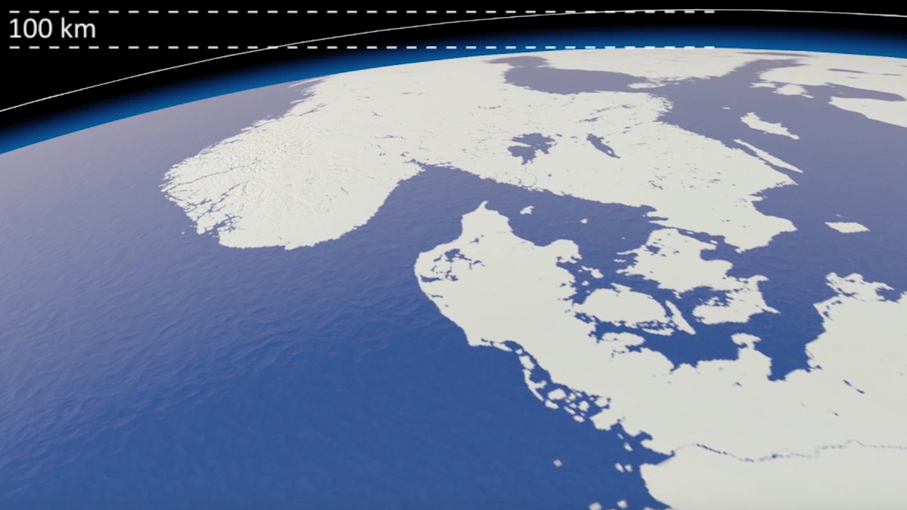
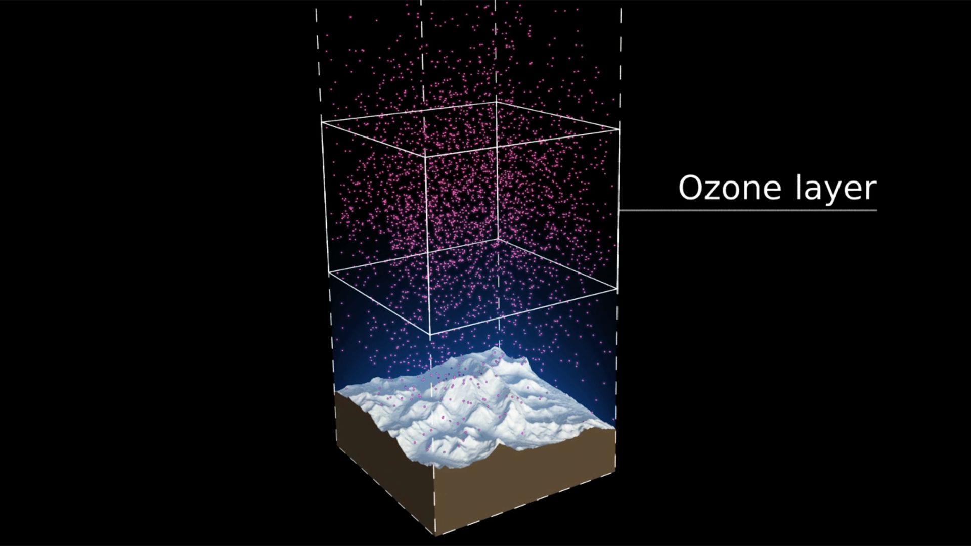
This 3D map of the ozone layer shows a 20 km x 20 km area of land (centered over the peak of Mount Everest) and all the air above it extending to an altitude of 100 km (the edge of space). More details here


THE OZONE SONG

A playful musical animation showing phytoplankton celebrating the 30th anniversary of the Vienna Convention with an underwater birthday party. More details here

SYNTHESIS REPORT DESIGN

An additional part of the campaign package was the graphic design and layout of the 2014 Synthesis Report. Download the report here.


The report was VERY well received. We got a lot of compliments not only on the content but also on the layout and readability. Thanks a million for your excellent work.

Professor A.R. Ravishankara, Report Lead Author
Departments of Chemistry and Atmospheric Science
Colorado State University


GLASS SCULPTURE MEMENTOES

We designed and supplied original sculptures depicting the ozone layer in the atmosphere for the chair, co-chair and hosts of the Meeting of the Parties 2-4th November in Dubai.

 
Photo credit: IISD

Photo credit: IISD


POSTERS, LOGO & SUPPORT

In addition to the films and interactives Carbon Visuals provided posters and logos in six languages as well as outreach support and evaluation.


All images are available under Creative Commons licence to download on our Flickr page.

UN Precious Ozone webpage: http://ozone.unep.org/en/precious-ozone

The Ozone Song

CLIENT

United Nations Environment Programme

PURPOSE

To communicate and celebrate 30 years of international effort in protecting the ozone layer.

DESCRIPTION

A playful musical animation showing phytoplankton celebrating the 30th anniversary of the Vienna Convention with an underwater birthday party. 

It is really NICE!  Thanks to the team.

Tina Birmpili, Executive Secretary, Ozone Secretariat, UNEP

Carbon Visuals is known for accurate scientific imagery of invisible gases and environmental challenges.  Providing a suite of material for the UN Ozone communications campaign gave us an opportunity to do something a little different.  

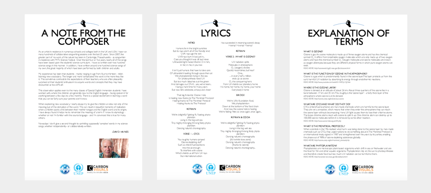
So we decided to commission a choral piece from science song composer David Haines.  And we created a simple animation and education pack to help schools and children around the world take advantage of this useful learning resource.  The education pack contains the lyrics for the song, a note from the composer and an explanation of some of the terms used.

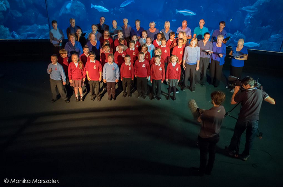
Composer David Haines rehearsing the Ozone Song with children from Ford Primary School in Plymouth. They will be performing the song in front of the giant fish tanks at the National Marine Aquarium on International Ozone Day (16/09/2015).

BBC filming performance of Ozone Song at National Aquarium with children from Ford Primary School, Plymouth and choir from South Devon Singers.

BBC filming performance of Ozone Song at National Aquarium with children from Ford Primary School, Plymouth and choir from South Devon Singers.

I liked the idea of an underwater party of tiny creatures celebrating the success of the Montreal Protocol.  Why should planetary healing just be celebrated by humans?

Antony Turner, CEO, Carbon Visuals

You can download the sheet music here: with piano or melody line only. If you are involved with a performance of the song, we'd love to see, so please upload your videos to our facebook page!

As an artist-in-residence in numerous schools and colleges both in the UK and USA, I have run many hundreds of collaborative songwriting sessions over the last twenty-five years. Since 2007, the greater part of my work of this nature has been in Cambridge, Massachusetts - as songwriter- in-residence with MIT’s Science Festival. Over the last four or five years, nearly all of the songs have been based upon the students’ science curriculum.

David Haines

The Ozone Song is also available with Spanish subtitles.

Ozone interactives

CLIENT

United Nations Environment Program

PURPOSE

To communicate and celebrate 30 years of international effort in protecting the ozone layer

DESCRIPTION

Three ways to explore the actual distribution of ozone in the atmosphere and a way to visualise the impact of the Montreal Protocol.

One of the problems with talking about the ozone layer is that few people have a good sense of what it is actually like. Many people have conflicting ideas about ozone and the atmosphere and this confusion can prevent full engagement with the subject. Interactives support other media such as movies, text and images by giving people a way to answer their own questions about ozone as they arise. How thick is the ozone layer? Where is it? How smoothly is ozone distributed? Sometimes it is just more fun to play with data yourself than to watch a video.

The Ozone Globe

We have created an interactive and self-running globe that displays current ozone distribution and also celebrates each country’s ratification of the Vienna Convention and implementation of the Montreal Protocol.

Click here to visit the interactive Ozone Globe.

2D air map

This interactive 2D map of the atmosphere allows users to explore the distribution of ozone for themselves. Each white spot represents 10 billion billion billion molecules of ozone. It allows for questions to be raised, such as 'what effect does ozone have on atmospheric temperature?' or 'why does ozone sit where it does in the atmosphere?'. The buttons turn elements of the map on and off, and you can drag the map to explore vertically.

3D air map

This 3D map of the ozone layer shows a 20 km x 20 km area of land (centered over the peak of Mount Everest) and all the air above it extending to an altitude of 100 km (the edge of space). Each floating particle represents 10 billion billion billion molecules of ozone. The region marked in orange indicates the ozone layer.

UN ozone celebrations

CLIENT

United Nations Environment Programme

PURPOSE

To communicate and celebrate 30 years of international effort in protecting the ozone layer.

DESCRIPTION

A campaign that includes a series of animations, visual images, print and online communication tools to help communicate what the ozone layer is, where it is in the atmosphere and what has been achieved under the ozone protection regime.

Thirty years ago the first images of the ozone hole created a media storm and helped lead to the Vienna Convention for the Protection of the Ozone Layer and the Montreal Protocol.

People only had to look at a picture to physically see atmospheric chemistry. It didn’t take much persuasion to convince the policy makers to take action. 

Pawan Bhartia, NASA atmospheric scientist

Carbon Visuals was honoured to be asked to create a digital campaign to communicate and celebrate the 30th anniversary of this event.  We did not want to ‘re-invent the wheel’ so we started by researching what we felt was missing from ozone communications to date.  

Our view was that few people have an intuitive sense of what the ozone hole is like, where it is, how much ozone there is, or how deep the atmosphere is.  So we have created a selection of visual images, animations and web-tools that help everyone from policymakers to children better understand these things.

Over the coming months different elements will be releasedalongside key events within the UNEP calendar.  This week, July 20-23, we are releasing two elements.

Precious ozone - the size of it

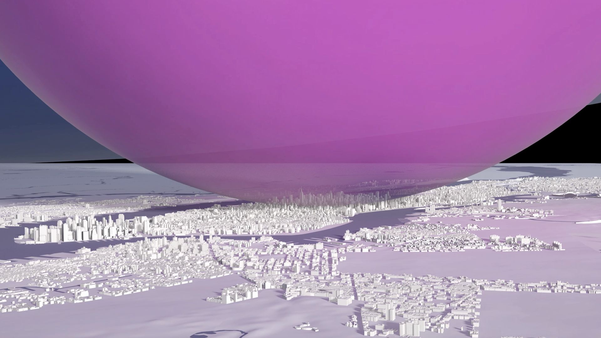
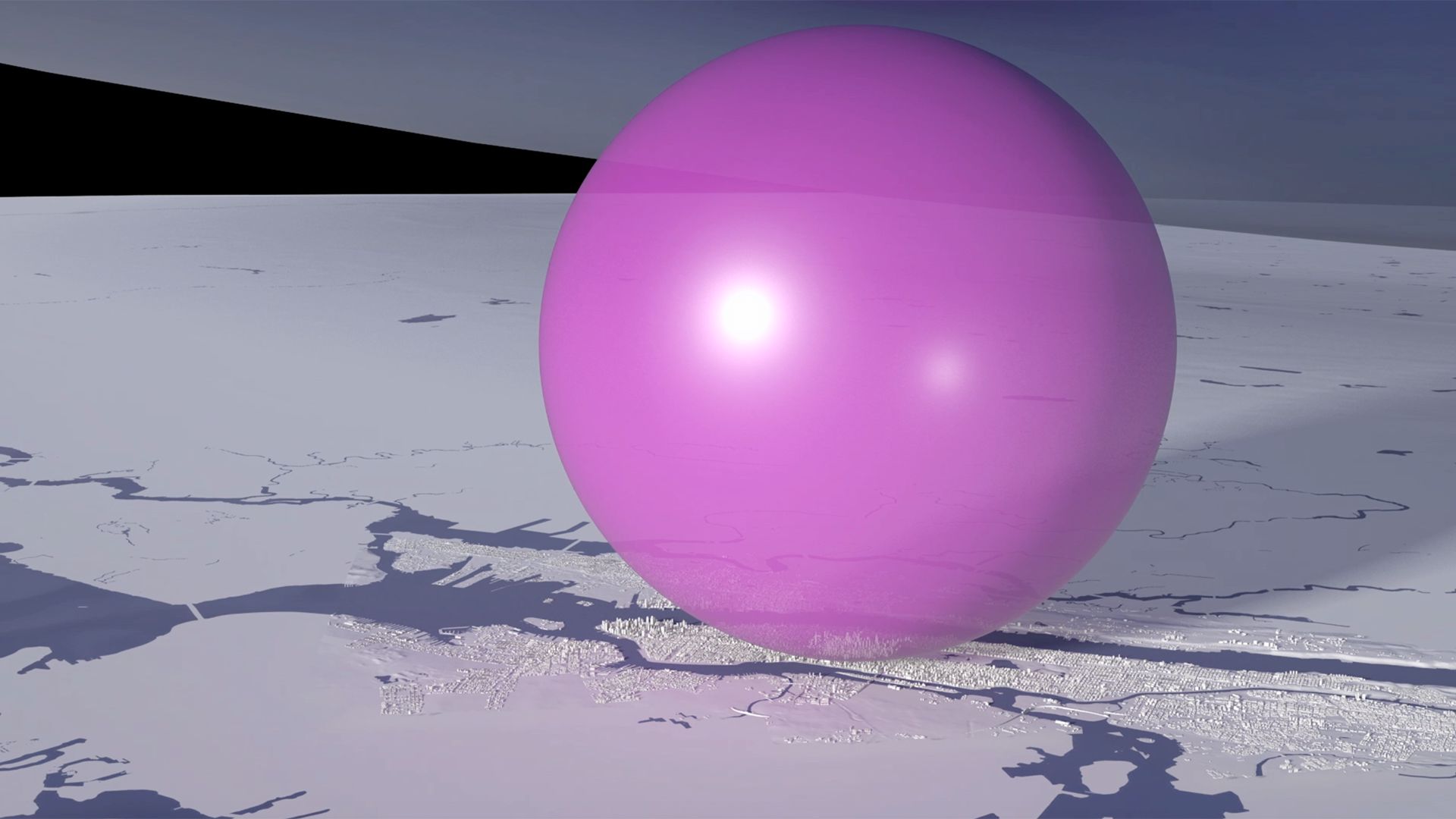
A short animation and a set of still images give viewers a sense of scale for how much air there is in the atmosphere and how much of it is ozone.  

Click here to view on Youtube.

Ozone Globe

An interactive / self-running globe that displays current ozone distribution and also celebrates each country’s ratification of the Vienna Convention.

Click here to visit the interactive


All images are available under Creative Commons licence to download on our Flickr page

UN Ozone website: http://ozone.unep.org/en/infomaterials.php

The Carbon Quilt - a global engagement tool

Instead of trying to communicate the complexities of climate change, we believe that a simple understanding of how we are changing the atmosphere of the planet could transform society’s view of the need for a low-carbon future.

Every day we wrap the planet in a paper-thick layer of carbon dioxide!

We’ve done the maths and it’s true. The 80 million tonnes of CO2 we release to the atmosphere every day by burning fossil fuels would be 80 microns thick if it were a single, uninterrupted layer at 100% concentration over our heads. Over the course of a year, that amounts to 31mm, or over an inch.

We call this imagined layer the Carbon Quilt – since pre-industrial times its thickness has increased from 2.3 metres to 3.2 metres.

In 2010, with support from The Tedworth Charitable Trust, we 'soft-launched' our Carbon Quilt web-tool that enables people to ‘see’ any carbon footprint – from a short car journey to the footprint of a country or continent. Any carbon footprint can be seen in proportion to any other, and in proportion to the global whole. It can also be positioned in a location that has meaning and provides a sense of scale for the person viewing it.

Carbon Visuals has ambitious plans to develop this technical prototype tool on Google Earth to bring the abstract concept of 'carbon footprints' to life for over a billion people worldwide.

We are now actively seeking funding and/or sponsors to help us to develop this project. Please contact us if you have funding ideas, contacts or expertise that could help advance this project.

BITC Mayday Network businesses' carbon footprint (and reduction)

BITC Mayday Network businesses' carbon footprint (and reduction)

To the left is a picture for the BITC (Business in the Community) Mayday Annual Report 2010.

Each year humans release enough carbon dioxide to cover the entire planet in a layer 37 mm thick. The proportion of this 'quilt' that reporting Mayday Network businesses are responsible for is the green 'patch'.

Total reported emissions in 2010 (green patch) is 5.6 million tonnes of CO2(e). Emission reduction in previous 12 months is shown as the dotted area.

It represents a saving of 400 thousand tonnes of CO2(e).

Global CO2 emissions in real time

How can you give people some sense of the rate at which we are adding emissions to the atmosphere?

Using 2010 data, we calculated that at standard pressure and 15oC the mean rate of emissions for that year would fill a volume the size of the UN Secretariat Building roughly seven times every four seconds. Working with our associate Lucy Blackwell we created a simple experimental low resolution animation which we have shown to live audiences on numerous occasions.

Some people find it “breath-taking”.